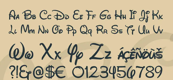
Importance of Fonts
According to the designers, the font plays an important role in designing the appearance of the site. No matter how common various graphical interface elements are, plain text, the author says, can do little to replace it. The choice of font for text on a site should be taken seriously, as it directly affects how the user consumes content.
Find Your Favorite Fonts
The reason why fonts are so important to the interface, is that they provide the user with the main impression of the site. A paragraph written in one font will be perceived differently than the same paragraph written in a different font.
“The job of a designer is to create a recognizable design and impress the user. You must convey information in such a way that the visitor can easily perceive it. ”
If a designer wants to improve the typography of a site, he needs to learn different aspects of it. For example, understand the difference between grotesque and geometric fonts, learn the principles of using leading, kerning, and so on. It is not necessary to become an expert in typography, but knowing the basic concepts.
Font selection methods
A font depends on each specific case and on what exactly the designer wants to convey with his design. It is impossible to unambiguously determine the “correct” choice of font.
Method #01:
Most designers, prefer sans-serifs because they blend better with other elements. “A writer goal is to match the general mood of the site with the goals that the company sets for itself. You have to tell a unique story – and the font can help you with this,”.
Method #02:
Some designers, deliberately choose a typeface that is drastically different from others in order to highlight a specific area. This technique is used, for example, to organize site navigation and visually separate links from the rest of the content on the page.
Note:
For those who doubt their choice, advises to carefully study the work of other designers and apply ready-made solutions. This can be helped by special browser extensions that help determine which fonts are used on the page – for example, What Font.
Importance of Headlines
“Not every visitor will be able to stay on the site long enough to get to the content. Your job is to get him interested in the first few seconds,”. A bright and catchy headline is what will help grab the user’s attention. For such tasks, there are special fonts that “cling” the visitor. “The title is an independent interface element that needs to be considered separately from the text and other content. It defines the content of the page and forces the user to pay attention to other content as well.”
When choosing a font for a heading, it is important to remember that it must be noticeable, it must stand out from other content. At the same time, the context of its use should not be forgotten – for example, an online magazine can afford to use a font that the site designers for a well-known investment company will not even take into account.
In addition, it is not at all necessary to look for catchy fonts in paid libraries – free options can work just as well. As an example, the designer cites the Insolent font , which is massive and stands out from other typographic solutions. He says “The important thing is that you like the font so that you can find a worthy use for it,”.
When studying the work of other designers, should not miss a single detail of the interface and typographic solution. Tooltip text, headings, navigation elements, links, lists, paragraphs of text, labels for images and videos – everything deserves attention. Their color, size and other parameters also play an important role, even for the smallest interface elements.
Also Visit:


