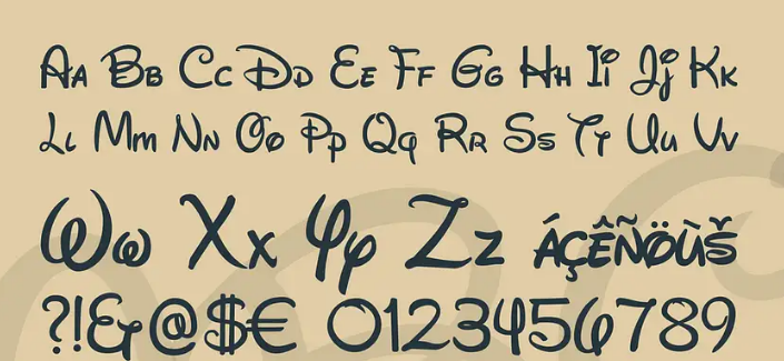
Spectacular typography is one of the most important factors in successful logo design. Each font has its own personality and impresses in a special way. The right typeface is the value and voice of your brand, while the wrong typeface can alienate your target audience.
So, with hundreds of thousands of fonts, how do you know which one is right for your logo and which font to choose? In this article, we’ll share six top tips to help you choose a font for your brand so you can pick the right typography for your logo. Ready? Let’s go!
1. Understand the basics
Before creating a logo that includes typography, it is important to understand the basics of typography. That is, understand the different types of fonts (serif, sans serif, cursive, monospace, display), the basics of composition, hierarchies, scaling principles, as well as concepts such as kerning and line height.
If you are not yet comfortable with designing your own font lettering, then choosing the right font for logo design will not be easy. If you’re new to typography, take the time to learn how it’s used in logos and general content. Analyze how different fonts affect certain emotions, their scale, the hierarchy on the page, and how these things affect the overall perception of the content.
When you’re ready to dive into designing your logo font, take a look at other logos in your industry and beyond, as well as how they use fonts.

2. Think about your audience
Knowing your audience’s expectations is key to creating a wordmark or any other logo. If your audience expects a certain look and feel from your brand (or your industry in general), you need to make sure that any logo you create meets those expectations.
If you are designing a logo for a new brand, you need to take into account your brand values and what your ideal audience might expect from a brand with those values. If your brand, for example, needs to be smart and you want to use fonts that give that impression in your logo, avoid something traditional like Baskerville or Caslon. However, if your audience consists of clients from industries with more traditional values (banks, law firms, etc.), a modern logo may not be suitable.
When designing a logo for a rebrand, you need to take extra care not to alienate current customers. There are many famous cases where a new logo has generated negative consumer reactions ( Gap’s 2010 logo redesign is one of the most infamous when the company scrapped the new design after just a week). Consider incremental changes rather than a completely new design.

3. Don’t follow trends
Logos must stand the test of time. This means that you should avoid trendy fonts. A typeface that feels cutting-edge today runs the risk of looking outdated in six months or a year, which could lead to another redesign.
A typeface that feels cutting-edge today risks looking outdated in six months or a year.
When a wordmark or logo is created without considering trends, it can be used for decades. Consider the Jeep logo. It has been in use since 1963, and although the badge in the logo has changed slightly over the years, the word “Jeep” has remained unchanged. That’s over 50 years of use!
An exception to the rule may be when you need to design a logo that will only be used temporarily (for example, for an event), and when the logo must point to a specific point in time. If so, then feel free to use a trendy font that will be immediately recognized as belonging to a certain era.

4. The simpler the better
Logos are commonly used in various sizes. Since some of these sizes can be quite small, the simpler the better. You need to create a logo that scales well and can be used wherever needed without having to redesign.
This does not mean that your logo must be minimalistic. But using the principles of minimalism, such as removing everything unnecessary, is a solid approach to logo design.
When choosing fonts for a logo, do not choose complex and intricate ones. Fonts with a lot of fine detail will not look good at small sizes, and important details may be lost.
This also applies to the number of fonts you can use in your logo. In most cases, you will need to choose one font, although if your slogan will also be part of the logo, you can choose a different font for it. If you do choose to have more than one font in your logo, make sure you follow the typographical guidelines for combining fonts .

5. Make the font special
No one says that the fonts in your logo should be used exactly as they exist. The most expressive fonts are those that are additionally customized and become somehow special, unique, and unlike the rest. Overlapping characters, combining styles, deleting parts of characters, etc. are all ways to make a standard typeface unique and connect it to your brand.
Special characters can be a great opportunity to customize the fonts in your logo. Ampersands can be one of the most creative features to set up as there are many variations of them. While I said earlier that you should be wary of combining multiple fonts in the same logo, the ampersand is an exception. As long as you account for font weight and weight variation, you can feel free to explore ampersands outside of the main font in your logo to find a font with the right mood and tone for your logo.

6. Combine text and icons
While some logos consist solely of typefaces, many also contain visual elements. Make sure the style of your typography matches the style of any icon or other element (such as a border or underline) that you want to include in your logo.
If your font is a traditional serif typeface (like Didot or Jenson), make sure your icons are also more traditional in look and style. Make sure that the style of each element of your logo is harmonious.


