Hello, world. The graphic is connected. And we work every day on data sets in the form of tables, charts, and infographics. The most popular fonts we have is, of course, Helvetica and it is suitable for most design solutions with quantitative data, but for a decent time of work, we managed to collect something else that we want to share with you today. For starters, let’s start with the principles.
Principles of font selection in our agency
1. Equal in height and width
The first rule when choosing a cool font for numbers is to make sure that it contains equal in height (lining) and equal in width (tabular) numbers.
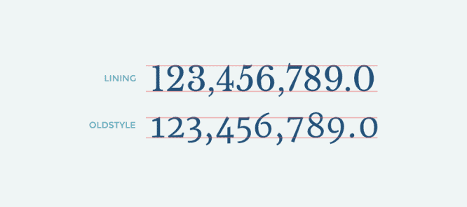
Top: Libre Baskerville; bottom: Merriweather
The term “equal in height” means that all numbers lie on the baseline and are aligned with the height of the initial letter, and do not have upper and lower extension elements. And the term “equal in width” digits, that numbers are monoshirine – each number climbs into cells of equal width.
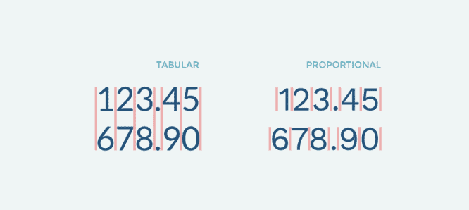
Left: Lato; right: Work Sans
This approach helps provide better vertical alignment. Of course, this is not a silver bullet, but for many cases it is the most important.
2. Suitable digital characters
The second step is to check the range of special characters. It so happens that in free fonts, special characters can behave extremely unpredictably. Therefore, it is worth paying attention to them before starting work.
For example, the symbols “$” and “%”.
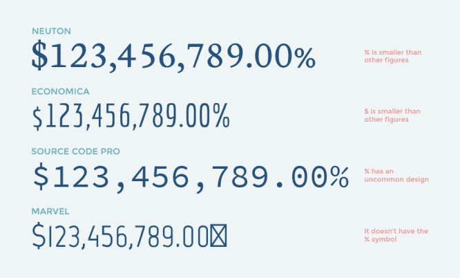
We always check the “%” and “$” symbols using the following test: $123,456,789.00%. If your dataset suggests more characters, feel free to add them too.
3. Check the design of each digit
Before choosing a font, double check the design of each dial – make sure that “one” does not look like “seven” and “five” does not look like “six”, etc.
Here are some examples of confusing numbers with a strange design: in the first, the digit (1) is unbalanced, in the second, the digit (1) looks like 7, and in the third, 4 looks somewhat clumsy.
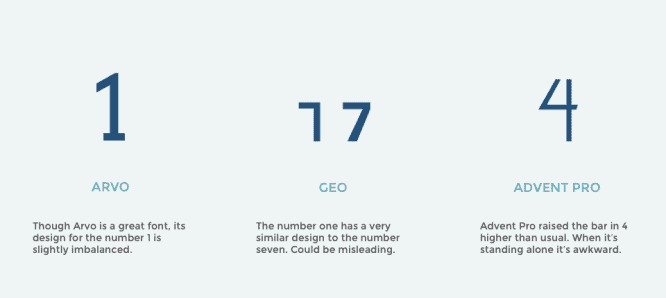
The Arvo, Geo, and Advent Pro fonts themselves are beautiful, but it’s in these borderline cases that there are slight flaws in them. Or maybe these fonts are simply not sharpened for data visualization.
Guidelines for font selection in Google Fonts
Armed with principles, we studied Google’s entire font library and selected the top five digital fonts in each category.
Serif fonts
Let’s start with serif fonts. Of course, there are many of them, but we reverently selected the strongest options for work.
1. Droid Serif
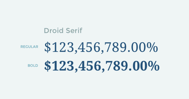
Standard, good, modern font with serifs and beautiful numbers. It won’t bring sophistication to your project, but it’s versatile and extremely easy to read on any screen.
If you’ve used PT Sans or Source Sans Pro, PT Serif and Source Serif Pro before, then take note, these are two more universal fonts with serifs and good number design.
2. Crimson Text
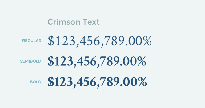
The size of the lines with Semi bold and bold is slightly reduced, otherwise they would be too long
Crimson Text is what you need for Garamond-style serif fonts. Here is a popular font with serifs, with characters equal in width, and equal in height.
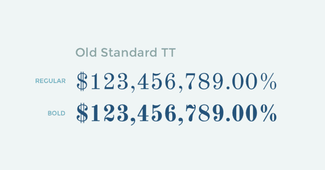
If you’re looking for a classic font with an elegant style, then the Old Standard TT is the way to go. With a double vertical line on the dollar sign and a beautiful wavy line in the numbers “2” and “7”, it will certainly create an atmosphere of antiquity.
4. Kameron
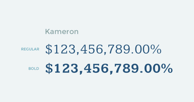
Kameron is not as well known as the fonts listed earlier, but it has good serif numbers and is wider than many other serif fonts. Here is a good font for numbers, which you should definitely have in your collection.
5. Copse
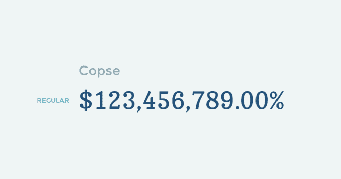
Known in narrow circles, this serif font is marked by its unique properties. He has an interesting toughness. In addition, it is very readable even with small font sizes.
Sans-serif fonts
In the category of chopped fonts there are many excellent fonts suitable for UI. We identified the two best, in our opinion, and the other three emphasized for their unique styles.
1. Open Sans
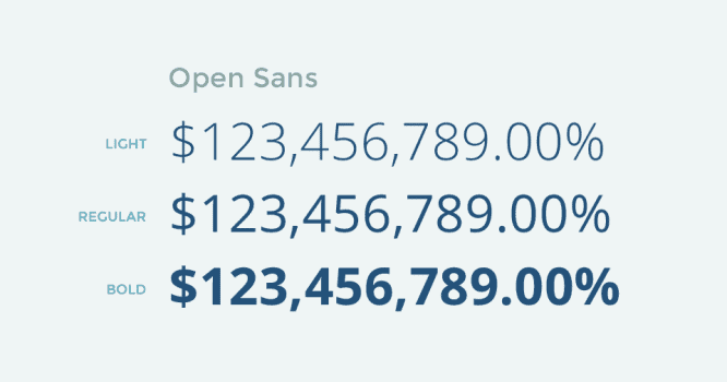
This font has more font weight options than shown in this image
Open Sans is now Google’s most popular font. Many will say it’s boring and already the same cliché as Helvetica, but it’s still a workhorse among sans-serif fonts with beautiful numbers. Try uncovering Open Sans for fonts on a nearby project.
2. Lato
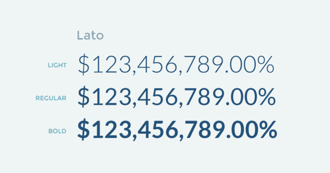
Also a popular chopped font. Lato differs in style from Open Sans, as it has a lower contrast and there is a dash at the base of the number “1”, but is also universal.
This font has more font weight options than shown in this image
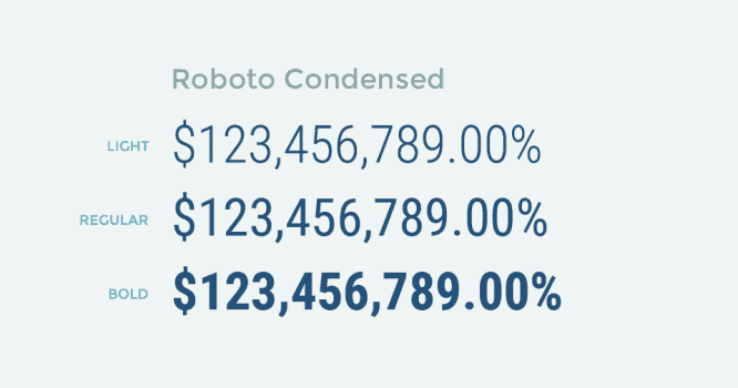
If you liked Oswald for its strength, compactness, then try Roboto Condensed. Roboto Condensed is the best tabular alternative we’ve found.
This font has more font weight options than shown in this image
Titillium Web has a unique style. It is square and harsh. If you want to convey a cold harsh truth, Titillium will cope with it.
5. Varela Round
Varela Round is the exact opposite of Titillium Web. He’s round and cute. If you need to make the numbers friendly, then implement them.
An important point, Varela Round is often used as a lite version of Montserrat. But in Montserrat there are no numbers equal in width.
Screen fonts
Chopped and serif fonts are suitable when you create a data table or dashboard. But, when you design an infographic or posters with giant numbers, you need fonts with a strong personality. The selection below is just that.
1. Graduate
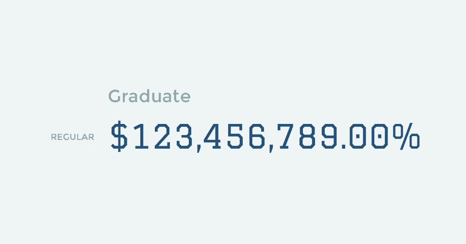
The graduate has beautiful numbers with left alignment. It is ideal for infographics related to education, and sports.
2. Change One

Change One gives you sturdy bold, equal-width numbers. It’s less formal than bold chopped fonts and can come in handy for entertaining infographics and posters.
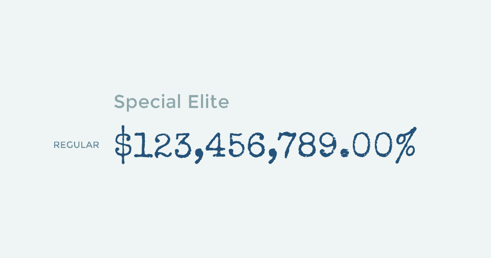
You won’t believe it, but this handwritten font actually also contains numbers equal in width. It’s perfect for conveying historical facts and for listing something so mysterious, like the number of murders committed in a text about a criminal. It’s a very unique font.
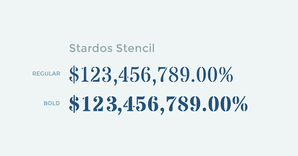
Screen font for printing on wrapping paper. And it’s good for hipster decisions.
5. Iceland
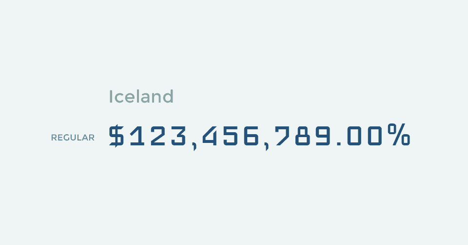
Iceland is a square modern geometric font, it is great for technological and mechanical data. If you need a higher font take Iceberg.
Proportional fonts
Keep a bunch of good fonts with beautifully designed numbers. But they have a problem, the symbols there are not equal in width. If in the current project you do not care about the vertical alignment of numbers, then they will do.
1. Montserrat
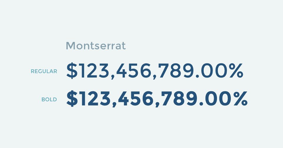
Without Montserrat, the list will clearly not be complete. He has nifty numbers.
2. Poppins
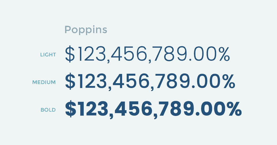
This font has more font weight options than shown in this image
Poppins has a cool numbers design. Well, yes, the number “9” is a bit awkward, but overall it’s a great font that has more font-weight options than Montserrat.
3. Bitter
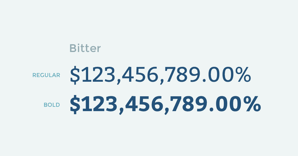
Bitter is a serif font. Excellent title font with large numbers. Like Montserrat and Poppins, Bitter is at odds around the world.
4. Ultra
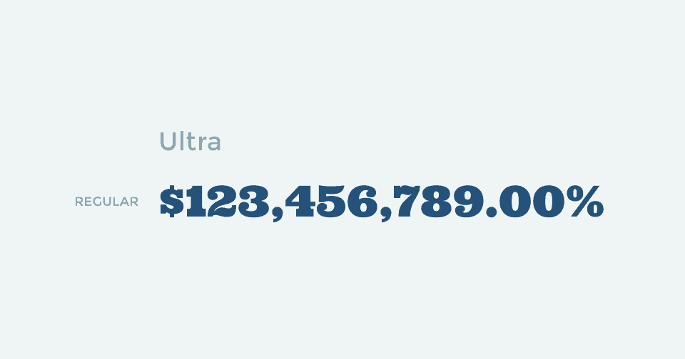
Ultra is a bold font. If it had numbers equal in width, then Change One wouldn’t have a chance. If you’re looking for a font for large numbers, such as a poster title, Ultra is a great choice.
5. Fjalla One
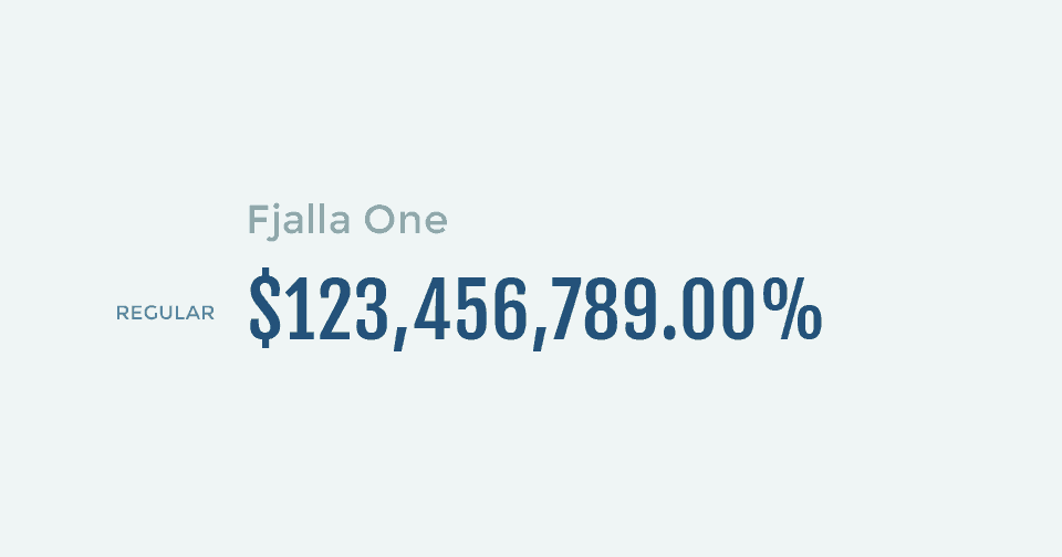
It took us a long time to decide whether to include Oswald in the list, because many people use it as a compressed bold font for numbers, and also as a free alternative to FF Din. But still, the dollar sign and the number “4” in the Oswald font look strange. So we decided to add Fjalla One as an alternative.
That’s it. Thank you for understanding our principles of font selection for data visualization and learning all 20 cool free fonts from Google for numbers. I hope you got this article!

